The Non-Designer's Design Book
Chapter 1: The Joshua tree epiphany
The four basic principles of design. (CRAP)
- Contrast - If the elements(type, color, size, line thickness, shape, space, etc.) are not the same, then make them very different.
- Repetition - Repeat visual elements of the design throughout the peice.
- Alignment - Every element should have some visual connection with an other element on the page.
- Proximity - When items related to each other should be grouped close together.
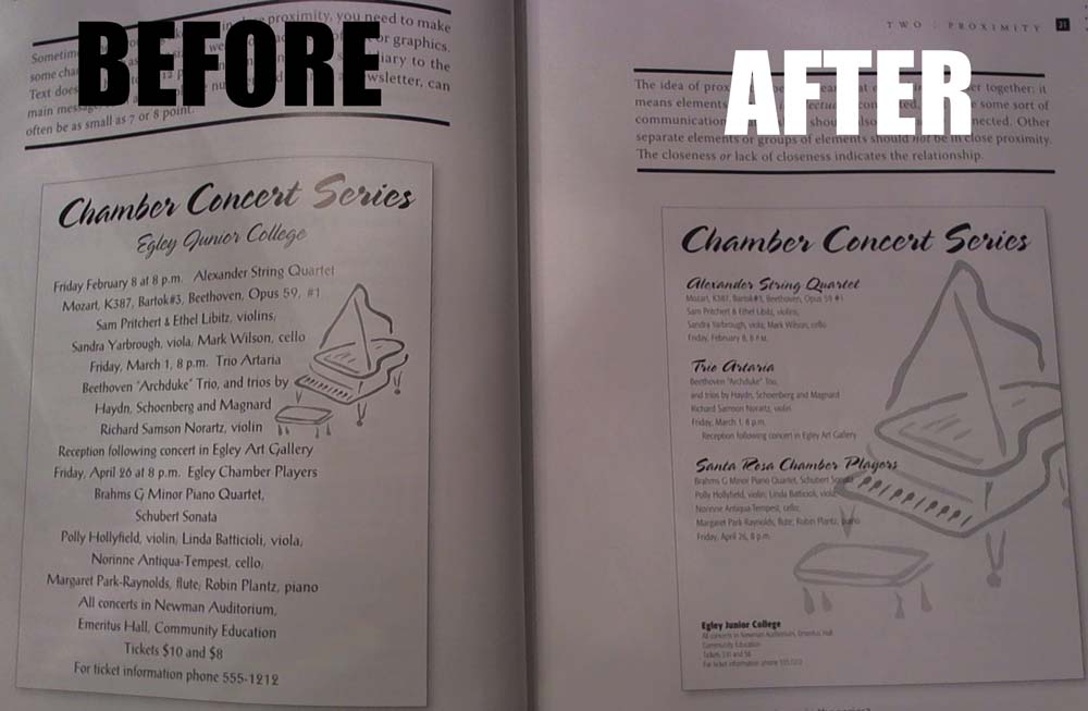
Chapter 2: Proximity
The purpose of proximity is to organize. Items relating to each other should be grouped together. When several items are in close proximity to each other, they become one visual unit rather several seperate units.
Items that aren't related shouldn't be close to other elements.When several items are close together they become one visual unit rather than several. Seperate information by grouping it. Information that is subsidiary to the main message doesn't have to be size 12 text, you can use size 7 or 8 font. Leave no "trapped" white space, it visually pushes elements apart if there are too many seperate items, group the ones that have relationships if there are areas where the organization isn't clear, check the item's proximity. The principle of alignment is to have it going from left to right so you can flush the left. Having all text in capitals can take up a lot of space you can use flush-left alignment to align elements together. Be conscious of where your eye is going and where you start looking avoid too many seperate elements on a page. Don't put things in the corners or the middle. Don't create relationships if items don't belong together
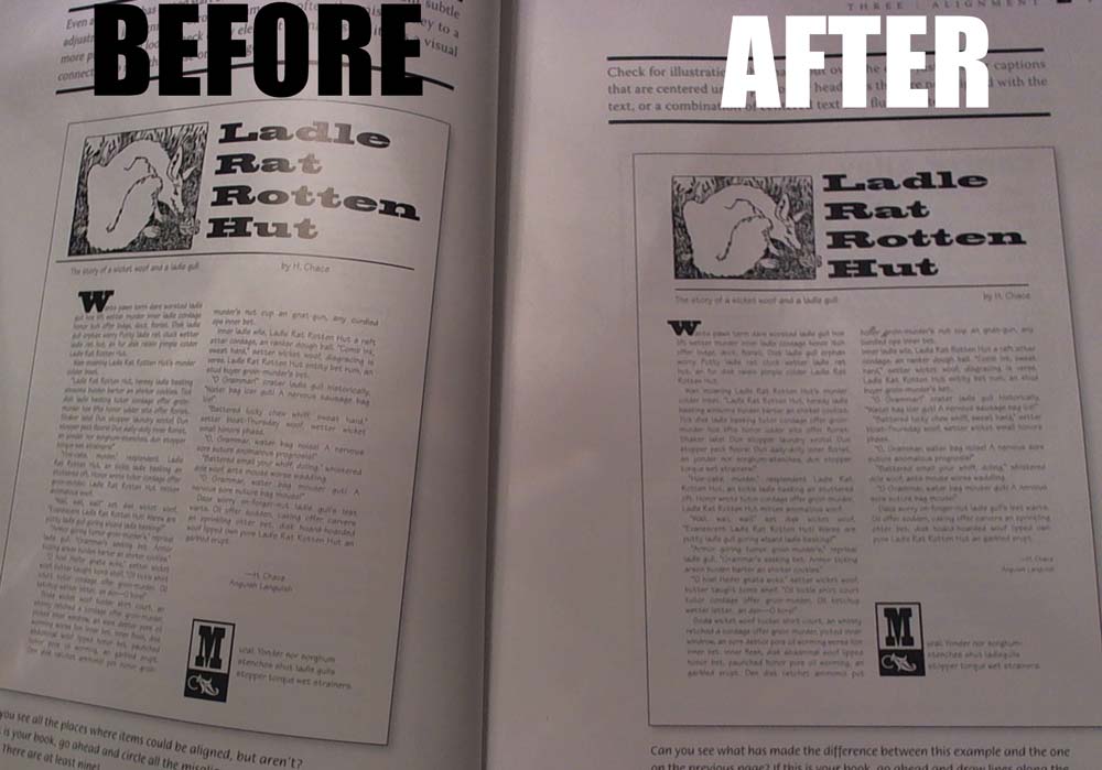
Chapter 3: Alignment
The purpose of alignment is to unify and organize the page. Unity is an important concept in design. Nothing should be placed on the page arbitrarily. Every element should have some visual connection with another element on the page.
when filling in space take items other than graphics and text into consideration. Nothing should be placed on the page arbitrarily. Every item should have a visual connection with something else on the page. Moving element to together and giving them one alignment makes them more organized. Don't use centered alignment, if you do be conscious. Only use justified if you want to avoid awkward gaps between the words. Find a strong alignment and stick to it. If your alignments are strong you can break through them consciously. Make all the elements on the page look unified